/facebook.svg)
/linkdin.svg)
/instagram.svg)
/youtube.svg)
%2Ftwitter_x.png&w=32&q=75)

%2Fleft-header-bg-shape.png&w=3840&q=75)
%2Fright-header-bg-shape.png&w=3840&q=75)
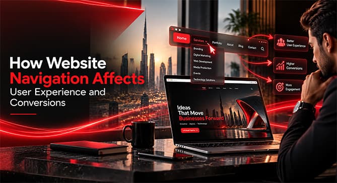
How Website Navigation Affects User Experience and Conversions
Learn how clear, consistent website navigation improves user experience, supports SEO, and helps visitors find the information they need to convert.
Introduction
Even though a site deals with good visuals and possesses unique branding and quality content, if a visitor is unable to find their way through the site, its virtues lose their significance. To put it simply, website navigation UX determines the manner in which users navigate the website, grasp its structure, locate necessary pieces of information, and accomplish vital tasks.
For the companies operating in Dubai, where individuals often compare services, check facts about companies, and make quick decisions, a straightforward navigation system serves as a distinction between continuing to explore and exiting immediately. Excellent design of website menus should not just be about ensuring the cleanliness of the menu template but rather about creating a path that will be easy to follow for users, helping them to achieve their objectives while also allowing the firm to maximize conversions.
Final Thoughts
Website navigation may seem like a small part of web design, but it influences almost every stage of the user journey.
A clear menu helps visitors understand the website. A logical information architecture helps them find what they need. Consistent UX navigation reduces friction. Mobile-friendly menus make the experience accessible across devices. Strategic internal linking can also support discoverability and SEO.
Most importantly, effective navigation helps users move from interest to action without unnecessary obstacles.
Spiral approaches web design with this balance in mind, combining structure, UX, responsive design, and business objectives to create websites that are not only visually strong but easier to navigate and built to support meaningful conversions.
For businesses investing in a new website or redesign, navigation should therefore be planned from the beginning rather than added as an afterthought. A website should not simply tell visitors where they can go. It should make the next step feel obvious.

/WhatsApp.svg)